(This article was reposted at Gamasutra.)
By 2015, using the Cerny Method the design students were able to create evolved prototypes of their game design. For example, the student above was able to create a Beat-Em-Up/RPG game within 10 weeks, and was able to showcase the game as a portfolio item along with other deliverables. Another problem then appeared: art. Or rather, designers forced to consider art issues. So this was the problem I tackled from 2015 till now.
This is MAMJ reviewing Light Up, a game by an all-designer team for their FYP. Having no programmers or artists on their team – which was the worst case scenario I was concerned would happen – they had to figure out how to deliver a fun, playable game. They settled on using RPGMaker and was able to deliver a horror game hacked into the engine.
The game was playable, created memorable responses among testers and MAMJ seemed to truly enjoy trying it out. As a proof of design, the game worked. We did however get a comment from the industry that the art is not impressive. This was settled by explaining the designers had no ability to work on the art, but it did made me realize that in the end, games are still judged by their art. Design, unfortunately, is obfuscated; you won’t get it until you play it.
Now, if art blocks people from playing a game, is it possible for a designer to do something with art? Especially if they’re stuck in a situation where they have no access to artists?
Should designers even consider dealing with art?
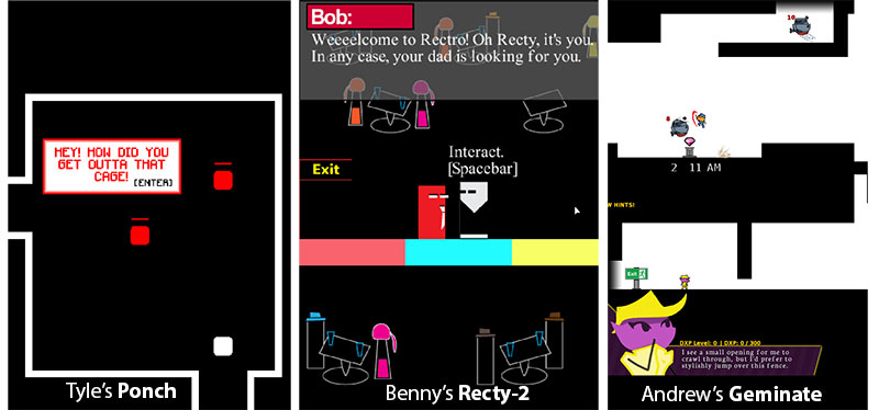
The fact is, design students do come with varying abilities in art. Sometimes we do get ‘purple unicorns’: design students who can do art and programming thus are able to create a very tight integration of all three aspects in their prototype. Andrew Sin’s Geminate (Image:right) is an example of this. However, we can’t rely on students coming in as all-rounders and an educational program should be catered to an average expectation of what students can do. Expecting design students to be able to do art on their own is unrealistic. Furthermore, game design is best proven with prototype art. If a game is proven fun with ugly art, then good art can only make the game better. Benny Chan’s Rect-y 2 (Image: center) and Tyle Ooi’s Ponch (Image:left) are good examples: they both have serviceable art that allow players to test the game to see what the game can offer.
If there is one good reason to get designers to do art, it is because it will allow them to not wait for artists in order to prove their designs. The design students cited above were able to convey the experience they wanted by generating their own assets. This ability has two advantages:
- Artists can be freed to work on other art assets needed.
- Designers can confirm their designs without needing an artist to be available.
So if it’s good for designers to have some art ability – but not be able to learn to do art by themselves – what should they learn in order to do a good game design?
How should designers deal with art?
This commentary is by Michael Ooi, a fellow game designer in our school. It’s an interview I require all design students to see as it clarifies an important point: the designer’s job is figure out how to make an idea work.
The purpose of design student creating a prototype of their game idea is to demonstrate how it should work if fully implemented in a game, thus providing a guideline for a programmer to follow. As the idea is represented in-game, the programmer sees how the idea is expressed and could work out how he or she would implement in the game engine of choice. In other words, by prototyping the game, the designer has helped the programmer determine the features needed and how the feature should function, with the actual play of the prototype providing parameters that the programmer could implement.
A similar idea can be applied to art. Designers don’t need to create art. They just need to be able to define how the art should work. By creating placeholders in a prototype, designers should be able to determine the dimensions of the art assets needed and answer questions on how the assets should work (e.g. What are the dimensions of the asset? Is it an animation? If yes, how many frames?). This alone is already handy: artists can use the parameters created by the designers and recreate the assets, knowing very well that correctly implemented art would fit into the game.
In the end, they’re technical parameters. Useful for programmers and artists, but is there more information a designer can confirm for the other members of the team? What details can a designer work out for art that goes beyond technical parameters?
Industry examples: Mockups and Reuse of In-Game Assets
An ex-colleague, Johaness Reuben, espouses the use of mockups to test concept of a game before going into the design in further detail. Joh was a Technical Art Director in my old company, thus was able to handle art and tech issues by himself. For him, creating mockups is within his skillset.
One of the rules I use in planning out education is that what I teach must be applicable outside of the Uni. There is no value in teaching students in a skill using a specific software, and have the skill be unusable if the software isn’t available at work or the skill is non-transferable to other software. What has changed compared to ten years ago was that software that used to cost hundreds of dollars to own is now cheap, and there are free versions available. Adobe Photoshop for example has been an industry standard for a good while, and to own a license to use it under the Photographer license is cheap. Furthermore there are free options with GIMP and Krita.
In this context, it makes sense to get designers to be fluent in Photoshop, or at least in the fundamentals of digital image manipulation. If the company would not provide the tool, they can use the free options, or own a license forgoing two ice-blended coffee drinks a month (your exchange rate may vary). What’s important is that understanding digital image tools would allow them to create their own art assets.
(Caveat Emptor: all of our students are required to go through a Fundamentals of Art module, which means they learned how to Photoshop. This means I have the confidence all design students I meet in the program will know their way in Photoshop).
What can they do with Photoshop? Well, a Wired interview with Donald Mustard of Chair(“Lightning-Quick Prototypes Brought Infinity Blade to Life” by Chris Kohler) brought an interesting example: it showed how Chair used their old game assets to test out their game ideas.
Next, Mustard showed the first playable prototype of the game (above), which used character models swiped from Shadow Complex. It already had many of the features that would end up in the final product, like the ability to swing your sword, defend and parry enemies’ attacks.
This version was ready to roll after only 10 days of development. At this point, he said, players were already enjoying the parry-and-attack gameplay.
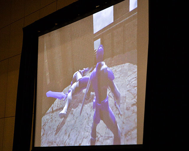
From https://www.wired.com/2011/03/infinity-blade-prototypes/ : Chair Entertainment’s Donald Mustard showed early prototypes of his iPhone game Infinity Blade at GDC 2011. Photo: Jon Snyder/Wired.com
Chair was able to test their design at speed because they have game-ready art assets at hand. I have spoken with another game developer and she confirmed that when the designers in her company wanted to test out game ideas, they would scavenge old art assets for re-use. What was important was the ease for the designers to find assets they could use to test their ideas; belonging in an established company meant being able to use what the company already has collected over time.
I realized that what would speed up designer testing was quick access to in-game ready art assets. This is precisely what student developers don’t have; unless the University or college has accumulated pre-existing game assets by senior students or collected/purchased existing art assets, every project ends up requiring art assets made from scratch.
However, the Internet is a treasure trove for existing art assets. Search for game sprites on Google and there’s plenty to find. One could also go to Spriter’s Resource, BGHQ and many other – easily searchable – game art asset compilation sites. The only problem is that it would be illegal and unethical to use them in a commercial project.
Obviously the students should not be using existing art if they desire to publish their game. Prototyping however is a different story. Prototypes aren’t meant to be published, and a prototype’s goal is convey working concepts as quickly as possible.
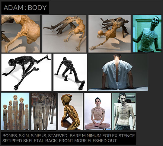
Reference images for the concept of Adam, from https://blogs.unity3d.com/2016/07/07/adam-production-design-for-the-real-time-short-film/ by Georgi Simeonov.
For example, in creating the Unity short film Adam, images that are most likely copyrighted are used as a reference tool. The point of using them is to convey ideas that would help the developers flesh out the final concept. These images will not be used in the final product; they are a base for ideation in order for the developers to arrive to the unique, workable concept.
I needed to see if allowing the use of existing in-game art would assist design work the same way. Since a design pitch could be a “this game with X”, a design student could quickly do visual test of how “this game with X” would be. If this efforts leads to a greater understanding of how the idea work/does not work, then the design student has clarified details that would be useful to the programmers and artists in his or her team. This provides more value to the designer’s concept that just ‘providing an idea’.
Tackling Technical Illiteracy
Once I considered the possibility of using existing in-game art, I realized it opens the process to several strong advantages.
- Mockups can be easily done if all game art is allowed. Which is good as a designer can confirm whether or not the screen design for the game idea works as quickly as possible. A design student can scour the Internet and create a collage representing the idea within a couple of hours. Visualizing a 2D game in mockup form would the designer solve 2 out 3 C’s from the Cerny Method: Camera and Character.
- Usage of actual in-game assets is also what designers would do once they are given access to an Editor. A designer playing with an Editor would move assets around, apply behaviors/scripts and test out design ideas to confirm what works and what doesn’t. By moving ahead and allowing ready-made assets in prototyping, I can assess how student designers would design if they have ready-made assets.
- Existing game assets also encapsulates concepts that may be difficult to convey. A student designer may have difficulty conveying a concept in words, thus would have to use references. If he or she knew of an existing game that conveyed the idea accurately, they could reference the assets that made the idea work.
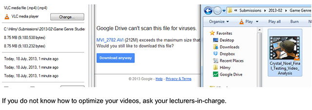
All these are good. There is another very strong advantage for using existing game art though: it teaches designers the importance of being technically literate. Since I have requested design students to provide videos of gameplay testing, I realized that the students we get are generally unaware of how unwieldy files approaching 1GB are. I don’t blame them for this: Current technology obfuscates technical detail. It’s easy to capture HD content on phones and not worry about it’s size, and fast internet allow easy transfer of large files. But it is noticeable that students are not aware of codecs and video file compression, meaning they are not aware of the ability to reduce the file size while retain the information conveyed.
Lack of technical knowledge can be corrected. Students however did not appreciate the need to know technical details until they encounter problems: once grading requires them to prepare the videos for presentation, they have to learn to optimize to make their lives easier. Essentially, they have never needed to know how to optimize videos until they saw a need for it. Once the need is apparent, learning happens.
That’s when existing in-game art becomes interesting. For example, a design student grabbing sprites from an existing game would find out that he or she would have to cut out the frames on their own. If the animation is smooth, the number of frames to be cut, formatted, imported and named would be higher. If the frame size of the movement set do not match, the character animation would jig onscreen. If the reference/origin/pivot is not set properly, the character may seem to float or sink through a platform. If the reference/origin/pivot for all the images in a set do not match, the character would jig.
These are problems that are obvious to anyone who games, and it is easily tested by anyone creating a prototype of their idea. This process reveals issues that designer can solve on their own instead of waiting for someone else to tell them. By discovering and solving these issues, the designer is clarifying how an art asset representing a concept should work within a game.
This thus fulfills Michael Ooi’s requirement: the designer is not claiming what to show in a game, but is figuring out how the idea should work when it is represented by art assets. The designer is solving implementation issues.
These are still technical parameters. But at least the design student is tackling the issues by himself or herself. What’s important here is that the design students are discovering what they need to know by encountering problems, instead of being told what to know and implement. As the parameters are proven by prototype, they are confirmed to work. Since they are working to understand how the technical issues affect their game design, they will become less reliant on other technical members of the team to help them. They are learning to become more technically literate because it helps them make their games better.
Now, can a design student take it further?
Designers solving artistic issues
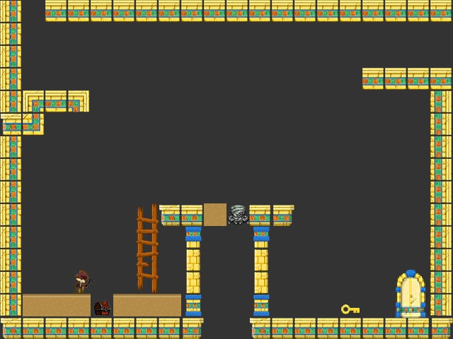
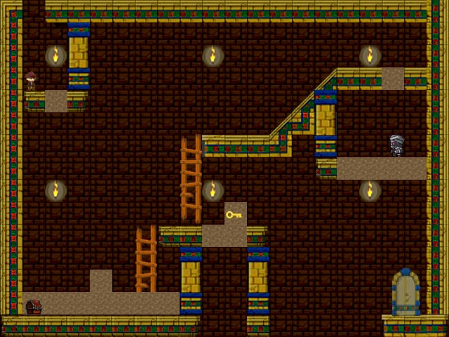
This is one of our design students’ Sil Jie’s initial mockup of his game idea, emulating the concept of Indiana Jones in an Egyptian tomb.
Now, what can be done? I can’t just tell them to ‘go make it better’; as untrained artists, they wouldn’t know what to do! What I can do as a lecturer is point out simple rules the design students can follow that does not require art experience. For example, a CG artist named Steven Stahlberg wrote an article outlining how visual perception works. What is fascinating is that he was able to break down the idea of what is ‘beautiful’ and ‘ugly’ to the viewer into simple rules.

From http://www.androidblues.com/visualperception.html Stahlberg demonstrating how detail makes a difference in the perception of an image.
“…every successful image has some or all of these attributes:
1. Detail (complexity)
2. Variation of this detail,
3. Breaks between different areas”
Stahlberg even demonstrated how it would work on simple 3D shapes.
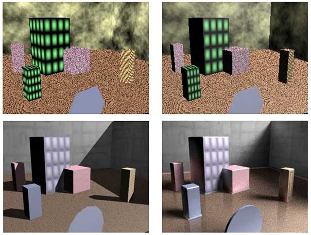
Compilation of images from http://www.androidblues.com/visualperception.html used in class. On the site itself, Stahlberg outlined what he did each step.
Stahlberg’s rules are useful. They are easy to understand for anyone without an art background and all a person had to do is apply one change at a time. Rules like this become one of the many guidelines I used in class to explain to the design students what to do with art assets.
Take for example, detail. The students are told to identify spaces without detail and simply add detail to it.
This upgrade is easy to understand: fill up the background, and the ground details. Sil Jie also did a study of how lighting in a tomb would look like, and he extrapolated the action of making his art assets darker.
Without understanding art concepts, but by analyzing works done before and applying simple rules, a design student was able to provide art direction for his own work. It also turns out that the rule he discovered is a simple action in Photoshop.
Will design students be good at providing art direction? That depends on their own personal ability. However, applying research and following simple applicable rules can take a design student pretty far on their own. The more a design student can do on their own, the less they need to rely on other members to solve development issues, thus freeing the rest to focus on other matters.
How class is structured
My colleague Johann Lim and I worked out a plan in mid-2015 to combine the assignments of the two classes into one project: one class works on the Cerny Method using prototyping+usability testing iterations, and another class would co-develop the same project but working on the look-and-feel.
Since the prototyping class doesn’t emphasize on media usage in any way, concerns on whether or not the game works with better graphics or sounds was transplanted into a Games Media Studies class. In Games Media Studies, the look-and-feel of the game would be developed matching the same iteration cycles in the other class. Roughly, it looked like this:
- Initial Prototype + Idea to convey
- Gameplay iteration + mockup of idea in screen form
- Gameplay iteration + improvement of assets based on suggested guideline
- Gameplay iteration + improvement of assets based on suggested guideline
- Final playable with Final version of assets
So it will take five weeks per prototype. The duration, or how many cycles the iteration repeats does not matter; students are required to provide deliverable work at the end of every cycle. Since the game has to be testable at the end of every iteration, any art used has to be usable within the game. Emphasis is on quick execution to quickly determine problems to quickly ascertain whether an art decision should stay or go. Extending the number of cycles would certainly make the offerings better, but for prototyping i.e. pre-production, the goal is to identify any issues as early as possible.
One more thing: designers have to communicate. Actually, everything a designer is supposed to deliver – design document, UI specs, level mockups, deliverable schedule etc etc – can be classified under communication. So art direction is only valuable if the design student can communicate it well. Meaning, if the design student did research to validate the reason why art is done in a particular way, then it is important for the student to be able to communicate the reasoning as best as possible.
Given that Kickstarter-style development and Early Access communication updates may be what design students have to do in actual future projects, then the obvious useful practice is for them to create a development Blog. So the design student would provide weekly updates on their R&D, and also work on making sure the details on the blog posts are communicated well.
Blogging may not sound much, but it’s essentially writing for an audience. There’s an understanding that whatever’s written must be interesting to hold a viewer’s attention to the end. The students have done documentation before, but here’s the test: can they write in a way that will make people want to read? Would the problem of team members not reading documentation be solved if the updates are actually interesting to read?
Blogging ties in well with Media Studies, as it is a media publishing platform: students have a vast repertoire of media elements they can use to keep readers interested. They may not write precise, mechanical documentation here, but we already have classes for that. This is a test on how well they understand the need to delight the reader.
In summary, blogging their development has three advantages:
- The design students will learn how to create a post that communicates when they’re not around. This works well for students who can’t speak well, but can write.
- It demonstrates who among the students can create good, communicative documentation. If they care about how the readers would understand what they’re describing, the blog would be a joy to read.
- That the blog, at the end of the semester, becomes a ready-made portfolio showcase of their work is a good bonus.
Results
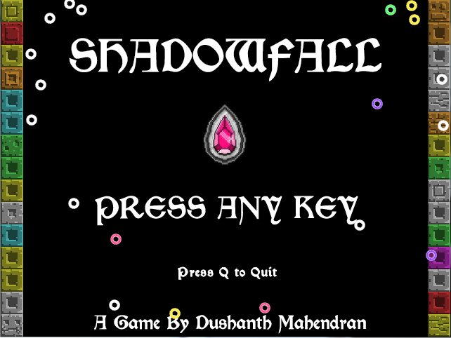
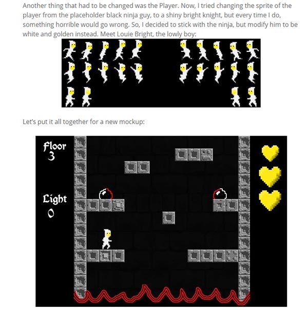
This is Dushanth’s Shadowfall. This was a game done in the 3rd semester of 2015. The final prototype is downloadable and playable here: https://dushanthdanielray.wordpress.com/2015/11/26/shadowfall-beta-release/
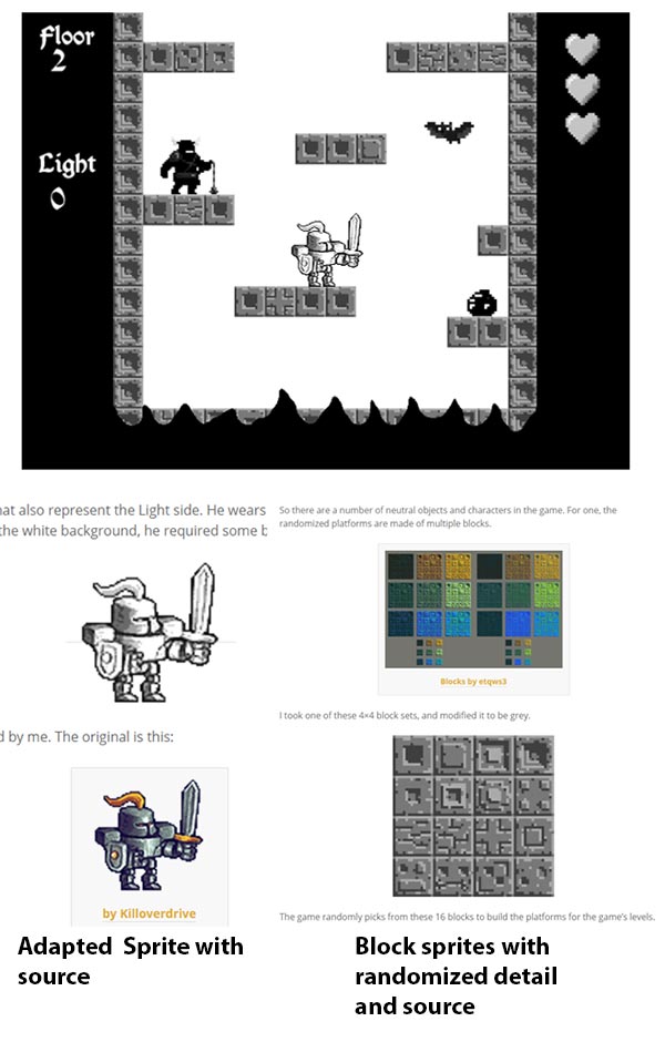
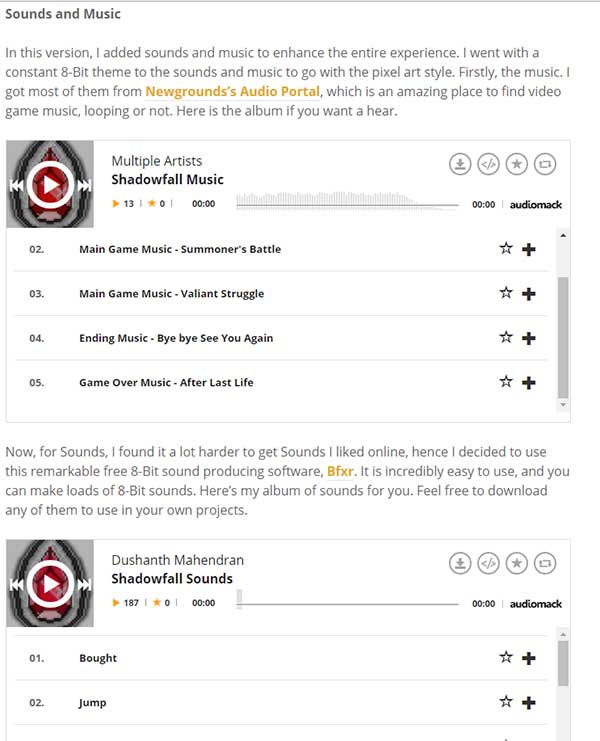
You can study how he conceived and improved the game – among others – in his blog: https://dushanthdanielray.wordpress.com/blog/. What was key for the Shadowfall posts was his descriptions on how he worked on the look-and-feel, along with the assets (and sources) he used.
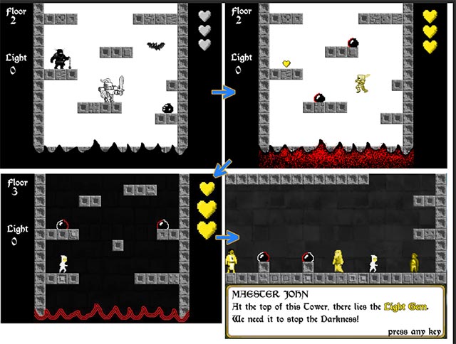
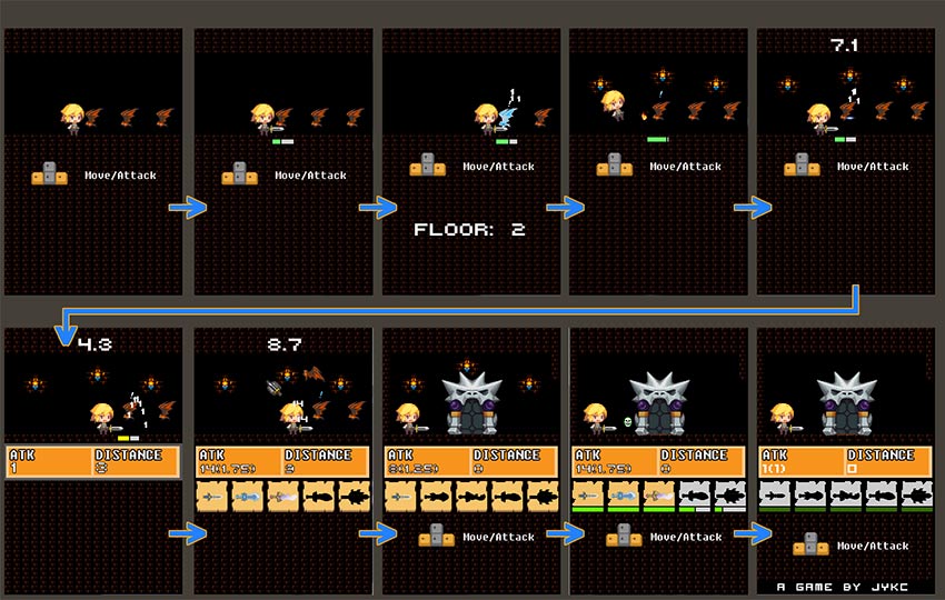
(Image: Above) This was his mockup+proposed assets done for Iteration 02, based on his roguelike idea elaborated on Iteration 01.
He documented an issue in Iteration 04 and demonstrated how he adapted the game and art. This is valuable as it demonstrates how he – as a designer – would go about solving problems he encountered.
All this can be described in a PDF, Google Doc or any downloadable document, but a blog has another advantage: various media services has worked ways to have their products be viewable in a blog.
Dushanth could embed images, sounds, videos that would help him explain his concept. Any software or document to be downloaded can be linked directly from Dropbox and Google Drive. It will all be presented in a blog post, i.e. a cohesive document accessible online formatted to ensure readers stay interested as they read it.
The design students can essentially construct any post they have into a pitch. And they can turn the pitch interactive with embedded media. By doing it in a blog post, the student doesn’t have to be there. The blog is doing the presentation for them.
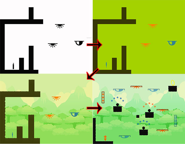
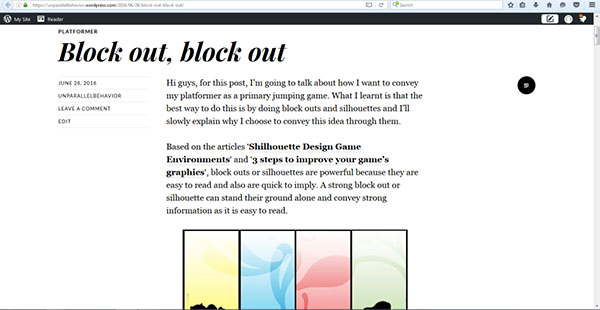
This is Sebastian’s Solar/Lunar, done in the middle semester of 2016. Details of his art development process is summarized here (https://unparallelbehavior.wordpress.com/2016/07/27/solarlunar-beta/) which also contains the link to his downloadable final prototype.
Within the summary are links to each of his art iterations (Image:Above is from Iteration 02) where he detailed what he needed to study, what he researched and how it affected the assets he used in his game.
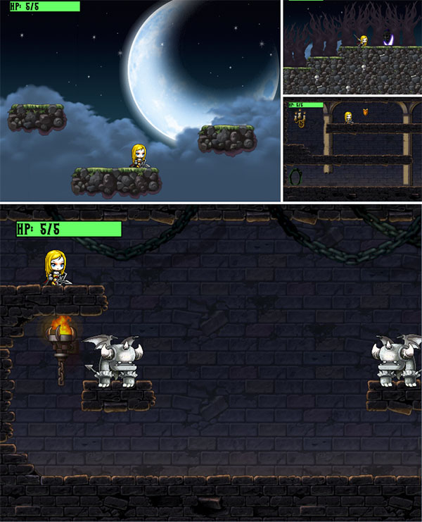
Joshua’s Dominion of the Night, https://joshykc.wordpress.com/2016/11/30/dominion-of-the-night-prototype/
Done at the end of 2015, Joshua’s 5-week prototype Dominion of the Night is downloadable at https://joshykc.wordpress.com/2016/11/30/dominion-of-the-night-prototype/. Joshua decided to focus on utilizing assets from Maple Story, which is compiled at Banned4. This allowed his to construct the specific character he was looking for and to pick assets from the game that fit his needs.
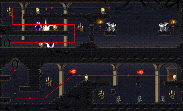
Since he was able to craft levels at speed, he was able to create documentation on how the game would flow in a single level, and what elements would exist in different sections for the level. Existing visual aids allowed him to craft useful flowcharts like these quickly.
Unfortunately, Joshua has removed the posts detailed how he evolved the game in five iterations.
Did it make a difference?
To recap, Image:Above showed a compilation of work from a 10-iteration process by design students, creating a prototype in 10 weeks. This was before the design students were given instruction on how to improve the art on their own, which is before 2015.
This is Joshua’s Tap Warrior, done in the first semester of 2016. The game is downloadable here: https://joshykc.wordpress.com/2016/11/30/tap-warrior-prototype/. This game was done in a class after Games Media Studies.
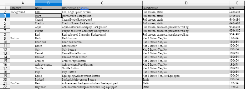
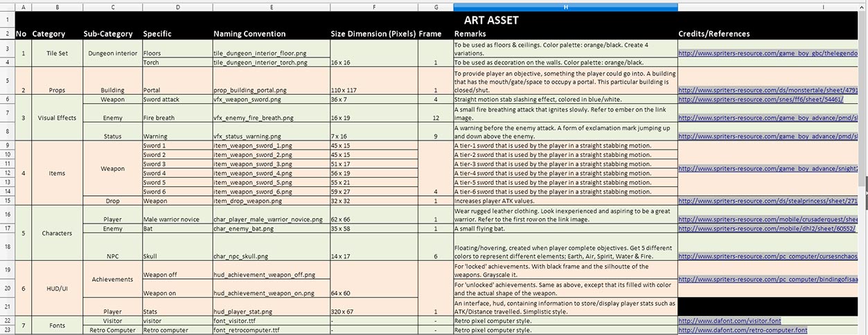
Joshua settled on his art style early on, and was able to offer a polished experience early in the project. What’s important to me was the Asset List he provided at the end of project:
The direction given was that the Asset List should contain details that would allow an artist to know all the specs he or she needed to create a new asset. As Joshua used existing in-game art, the sources were included on the right hand side. Since Joshua used the in-game art assets himself and confirmed how they would be used within Stencyl, he was able to provide accurate parameters, including file names. Ideally, any artist can play his game and understand how the art assets should work, peruse the Asset List and have enough information to create replacement art. If there’s any doubt, the source can be downloaded for checking.
Ideally, if an artist were to follow the specs on the Asset List precisely, the assets can be slotted into the existing game without a hitch. Since the designer has worked out why an art asset should be that way, the look-and-feel should be clear. If the designer is pressed to explain why he or she wanted it that way…..well, that’s what the Blogging practice is for.
This effectively handles my concern over the use of existing in-game art: once a designer gets a willing artist, replacing them is easy. The prototypes would never be a commercial product, but since it shows how gameplay would work, it becomes a tool that could help him or her convince artists to work on assets. And if an artist is willing, the designer has already done his or her homework in art asset documentation and planning.The details are simply a link away.
If the designer has not found an artist yet, he or she can still show the quality of the design. Art is not a block anymore.
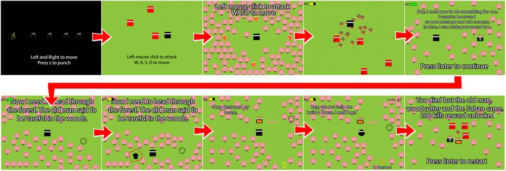
Sebastian’s Kill 35 Ninjas, https://unparallelbehavior.wordpress.com/2016/11/23/beat-em-up-adventure-base-building/
This is Sebastian’s Kill 35 Ninjas done in the last semester of 2016. He detailed his 10-week development process here: https://unparallelbehavior.wordpress.com/2016/11/23/beat-em-up-adventure-base-building/
Sebastian chose to create his own art, but again, he deliberately polished the art assets with his own style. The game works, and the visuals are unified in style that fit what he intended to show.
Both the two examples showcase a point: the game doesn’t need any more art beyond what exists. Character animation for Tap Warrior may improve the game, but in its essence, a single character image works just fine. Sebastian’s squares convey enough information about the characters that the simplified shapes communicated enough appeal, so further artwork may not be necessary.
What I am satisfied is that the design students are now more confident in determining how art should work in their game design. They could initially work with placeholders and provide parameters, but now with the ability to polish the art and define art direction, they can go further and specify the look-and-feel of their prototypes. They could research media upgrades on their own now and experiment on how it would improve the feel of the game by prototyping. They can say no to upgrades if they see it will detract from the concept, and if it is an art direction, they can explain and show references on why.
In the end, the design students can now make stronger, independent decisions regarding their designs.
Future Research
This approach only applies to 2D, so an approach on how design students would handle 3D art assets is something worth looking into in the future. That would take more work as 3D is certainly more complicated than 2D. While 3D development software are becoming easier to use, the need to tackle technical illiteracy becomes higher once a student moves from 2D to 3D. The jump will require some more thought.
It is gratifying to note that there are now more free assets available to play with. The Infinity Blade art assets are now free to use on the Unreal Engine. The Unity Asset Store has free assets, and Kenney has been widely cited. This opens more avenues of experimentation for any aspiring designer. There are also available tools online that greatly simplified the work in creating prototype assets: Bfxr and SpriteCow were commonly used by the design students. Since the students are sharing the knowledge of these tools with each other – they are presenting it in their blog after all – they end up empowering each other by increasing their overall ability to handle issues.
Fact is, free assets and free tools will become more comprehensive in the future, thus what’s possible for a design student could get very interesting a few years down the road.
