Previously I posted on the prototypes my game design students did for their game design classes. This post is on one of the processes we used to improve the design of their prototypes: usability testing.
The research and application started in 2013 where I was looking into the best ways to teach design for design students. As cited, one of the strongest feedback received was to get the design students to create prototypes. The second strongest feedback I got was to train them to design based on feedback. That is, to collect data from users, and to create a design that would respond to the issues pointed out by said data.
I recognized the application; it’s what online games do when they track user behavior and adapt their game to maximize wanted behavior. It’s a process used by Facebook games in the late 2000s and being used now on data collected from users on mobile games. The feedback made sense in terms of keeping designers relevant.
That means figuring out how to do playtesting for designers in order for them to collect data to analyze.
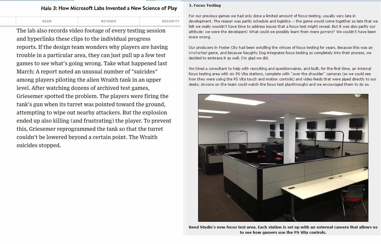
Two of the seminal articles I found instructive on playtesting were http://www.wired.com/2007/08/ff-halo-2/ and
http://www.gamasutra.com/view/feature/181082/postmortem_sony_bend_studios_.php, where they wrote at length on the extent of their investment in collecting data on player behavior. Great articles, especially when they spoke about finding out design issues that couldn’t be discovered without observing what the players were doing.
However, the equipment cited to apply their methods is beyond the reach of a regular person. It is possible to get funding to create such a lab, but that doesn’t benefit a graduating student; a method they can only use in University would not be useful once they graduate.
I had to figure out how designers can collect good data without costing too much. If it’s free, all the better as it means they can apply it anytime they do design.
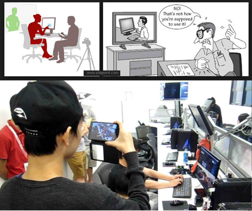
Having taught in a Multimedia Faculty and doing Production in a web development company, I was familiar with a concept called Usability Testing. It’s a form of testing that determines what were the faults in a design by observing a user using the product without interference, and collecting data on how the user behaved. Without a person guiding the user on what to do – and not to do – flaws that were not obvious to the designer were revealed.
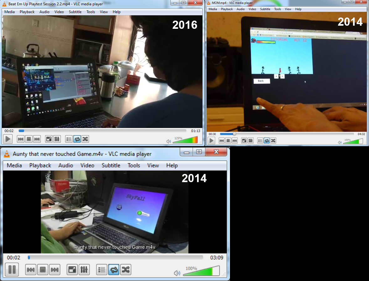
After testing various setups – sending design students to observe outside of a glass room, etc – it turned out that the simplest and cheapest method was to ask the students to use their mobile phones. To conduct a test, they were given three instructions.
1: Set up a place where you can record someone playing your game using your mobile phone.
2: Make sure the video captures the screen and the player movement using the control devices.
3: DO NOT INTERFERE with the process. Keep quiet, don’t help and don’t answer questions until the test subject said they want to stop playing.
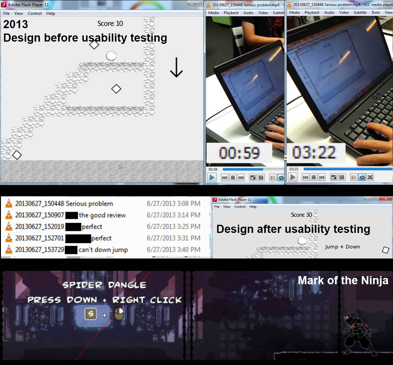
Usability Testing for designers was started back in 2013 and it began generating results. The game above had a design flaw: not all players know how to drop down from the platform. “Down + jump” may seem something obvious to gamers, but Usability Testing for the build showed two out of five users could not figure out how to get down. One user could not do so for almost three minutes.
Reviews of the video showed the user able to play well before reaching the section. It was during the section itself that he got stuck, and he tried hard for almost three minutes before giving up. In any other situation, telling him what to do would have helped. However I made one point clear to my designers: if your game can’t work without you pointing it out what to do, you’re not making sure your game is playable.
Once the flaw was revealed by video playtest, the designer modified the instruction to make it clearer. Future playtests showed the issue was solved.
Some students have objected to the idea of providing instructions that was too direct or too helpful. I pointed out some games do this – example in pic was Mark of the Ninja, which showed a message when a player died at one spot far too often – and these should come out at points where the designers know the players are having a hard time at.
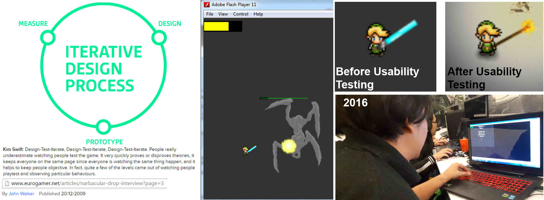
Usability Testing also proved useful in providing solutions. Having heard of Kim Swift’s mantra – “Design-Test-Iterate, Design-Test-Iterate, Design-Test-Iterate” – I worked for years figuring out an Iterative Design Process that would link the phases of design, prototyping and testing into a cohesive, repeatable loop.
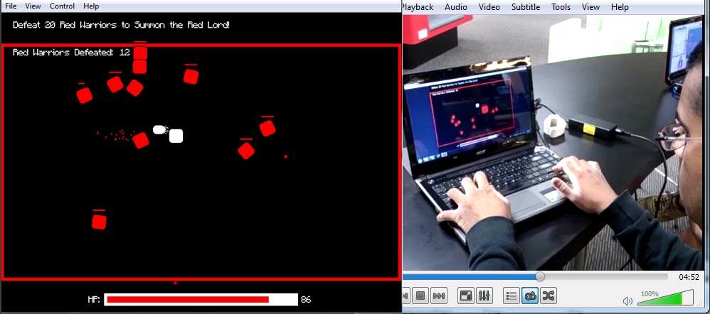
Kim’s statement on using testing to disprove theories was very useful: here, the designer reported that the users commented on how difficult his combat mechanic was. Having tested his game, I found the mechanic to be workable. That doesn’t match what the users were saying, so it’s an indicator for more in-depth analysis.
We both then went through the testing videos. Watching how the players play, it became clear that the players saw the lightsaber sprite and assumed they’re wielding a lightsaber; they tried to maximize damage by waggling the saber sprite. The mechanic doesn’t support the extra effort thus the players were frustrated. I pointed out that instead of trying to change the code, consider finding a way to communicate how the weapon actually works so the players would instinctively know what to do.
The designer’s solution was effective and simple: he changed the weapon to a torch. Future testing showed the issue has been solved.
I didn’t know this when I was looking into the problem since 2013, but I was solving an issue of designer empathy; a problem where the designer did not care how his or her design impacts the user. What I noted back then was that we had plenty of design classes on design document writing, systems design with numbers and design planning, but no class focused on how fun it is for the player as they play the game. Thus I emphasized on it to complement the other design classes.
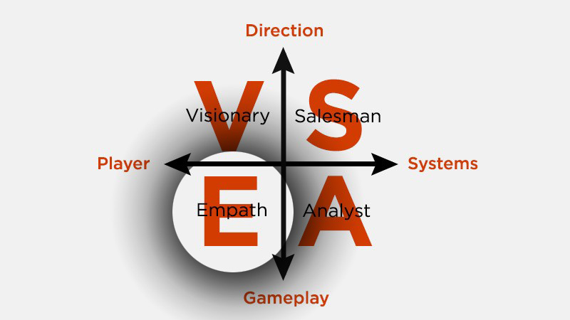
At GDC 2015 Richard Carillo did a breakdown of designer types which we found very useful. We now require our design students to go through the chart and identify what kind of a designer they are, as that would tell us their strengths and weaknesses. More importantly, we’re able to determine the design focus of our design classes, and my gameplay design classes were focused on the Empath type of designers. Usability testing thus was useful as it forces the design students to focus on what the players think and feel as they play, not on what the designer thinks is good for the player.
One fun side effect of Usability Testing was The Mom Test.
The students were merely instructed to find testers, and some went as far as letting their family members try their game out. These are always entertaining, as unlike fellow students, family members are quite free in their commentary of the game.
One on hand, seeing people who are not used to gaming is very useful for designers; to appeal to the mass public, a game must be appealing to a non-gamer. Rovio’s game designer discovered how good their game could potentially be when his Mom burned their Christmas turkey while playing the game. By watching how a non-gamer plays a game, the designers get very good feedback on what really worked and did not work in their design.
There’s one catch though: Moms can be good at games. One playtest video showed a Mom claiming she was terrible at the game she’s playing, but the video showed her gameplay and hand motions; she was actually quite good. She played better than her son. It is one of many examples we’ve seen of how the commentary of the game – and the player – does not match the actual play, and thus our designers are taught to check the validity of reviews and commentaries by checking the playtest videos.
I spoke with a AAA-dev and she confirmed that letting Mom’s test their game out was a practice where she works. She was the one that called it The Mom Test, and thus the name stuck.
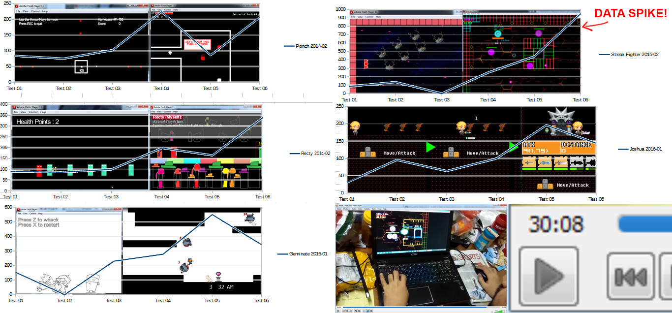
One distinct advantage of collecting playtest videos was that I could collect metrics. Videos contain lots of information on play. I could, for example, compile how many seconds in total were testers interested in playing the game before they game up. If I collect the same data for all playtests for a game being developed, I could see whether or not the game in increasing the length of player interest over time.
So not only could I see how the game design evolved, I can also see how well the evolution was received.
Over the period of six tests – meaning a minimum of six iterations – it made sense for earlier games to be short in play and the average playtime to gradually increase over time. It’s not all roses however as some tests do fail. Disregarding failed submissions, design students are encouraged to try out design ideas, and to consider being able to demonstrate a failed mechanic as part of the process; a failed mechanic identified early means it gets corrected early.
What really catches my attention is when I get a spike: a play video that’s longer than anticipated. It’s common for the students to go back to the same testers, and a small increase in playtime for regular testers is normal; they just want to see what’s new. Sometimes, we get a regular tester that gets engrossed due to a small change in design. The spike above is due to one tester clocking 30 minutes of gameplay. We sat through the playtest video (half a GB in size) and sure enough, the player was proven to be interested in playing the game for half an hour. For a Flash game that was done by one person and it started off about ten weeks back as a game that only got 1 minute on average playtest time, that was a very interesting result.
So the next step is pondering what were the right decisions these designers made, and how that can be passed on their juniors.
Till next time!
Nice article.
Usability Testing is the vital key on knowing if your design works or not. And after doing this tests for a few times, you will get to know common mistakes and fix them and move on to other issues. So if the process is repeated at a constant space of time, the designer will see, learn and improve their design process and also their design decisions.
Thanks for the article.
The MOM Test. Always a classic.
Still works for me.
Best regards,
Narishvin.